Colour
- Granite#213532 · Surface
- Page#F1F3EF · Canvas
- Signal#C9F59A · Action
- Data#7DAEE8 · Plan share
- Ink#0E100F · Text
Signal is the only action colour. Data blue is reserved for plan-share and charts. It never carries meaning on its own.

Healthcare, without the maze.
A large US healthcare organisation needed members to understand their benefits, find care and read a claim without first learning how the company is organised internally.
The work wasn't redesigning screens. It was turning a dense collection of insurance workflows into an experience people could read and act on in a single pass.
Client under NDA · Organisation, network, plan names, figures and branding fictionalised
Members arrive unsure, sometimes worried, often unfamiliar with insurance language, while the platform still has to expose a great deal of detail. Four frictions kept repeating.
Understanding my healthcare
The member’s goal
Health and insurance detail scattered across unrelated parts of the experience.
Claims, benefits and providers mirrored internal systems, not member thinking.
Information arrived without an action, so members simply searched again.
The path from self-service to a human was never visible until it was needed.
Members needed clarity. Fragmented information, unfamiliar tasks and hidden support kept getting in the way.
Four moves, run as a loop rather than a relay. Each one fed the next and came back around.
Stakeholder interviews, workflow analysis and the gaps between what members needed and what the system exposed.
Information architecture, journey models and prioritisation rebuilt around member intent.
Low-to-high fidelity flows used to settle product questions before anything reached a sprint.
Responsive specs and design-system patterns refined alongside engineering, review by review.
The earlier model asked members to navigate departments and systems. The portfolio concept brings tasks into five peer destinations, with support available across the experience.
Home
Member Overview
Find care
Within the Selected Plan
Claims
Dated Care and Cost Ledger
Benefits
Limits and Network Costs
Nivora 360
Reminders + Ongoing Support
Member Support - Available when a member needs guidance
Six member journeys replaced department-led navigation. Every surface follows the same order: status, meaning, action and support.
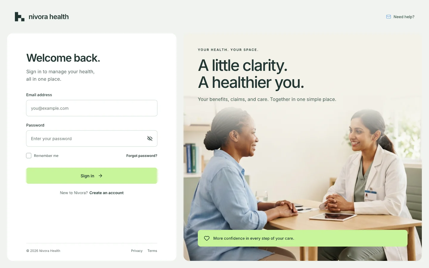
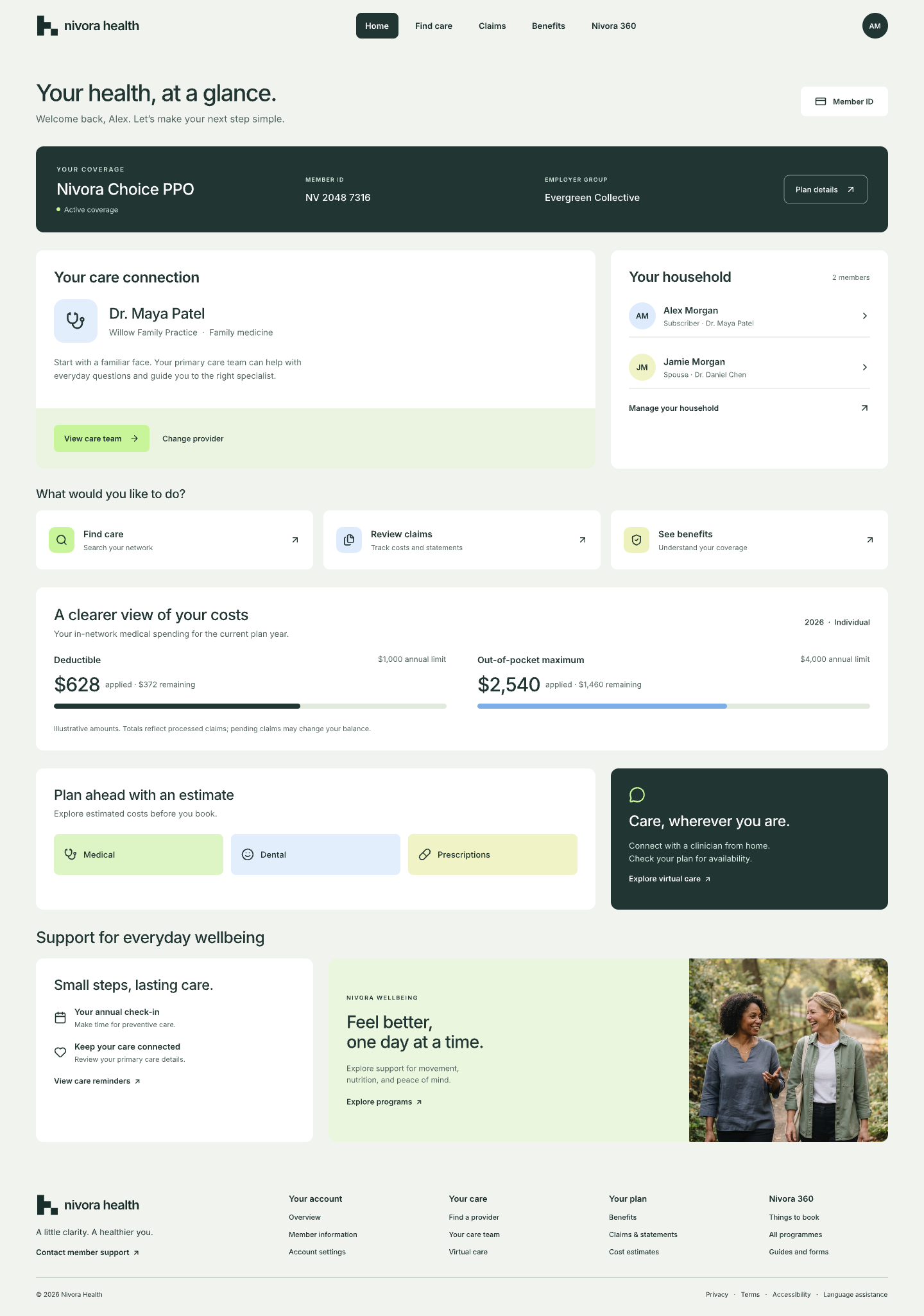
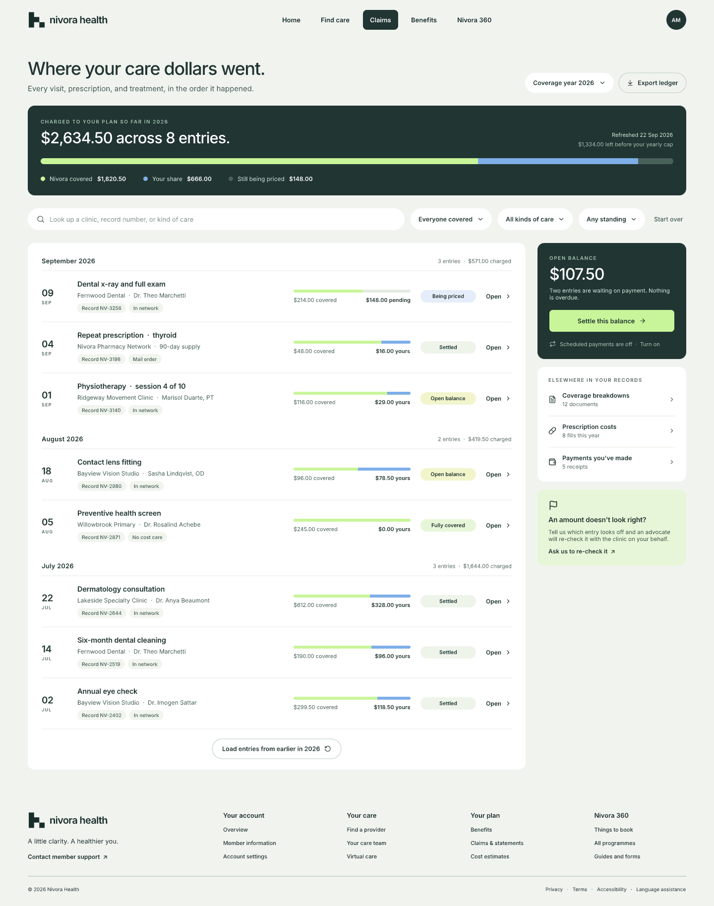
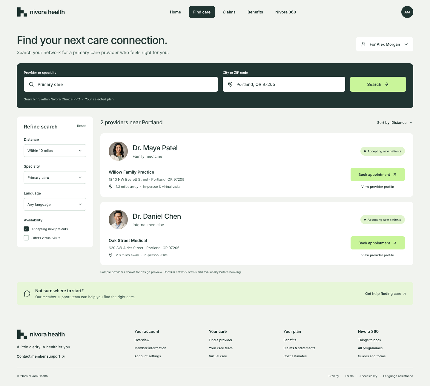
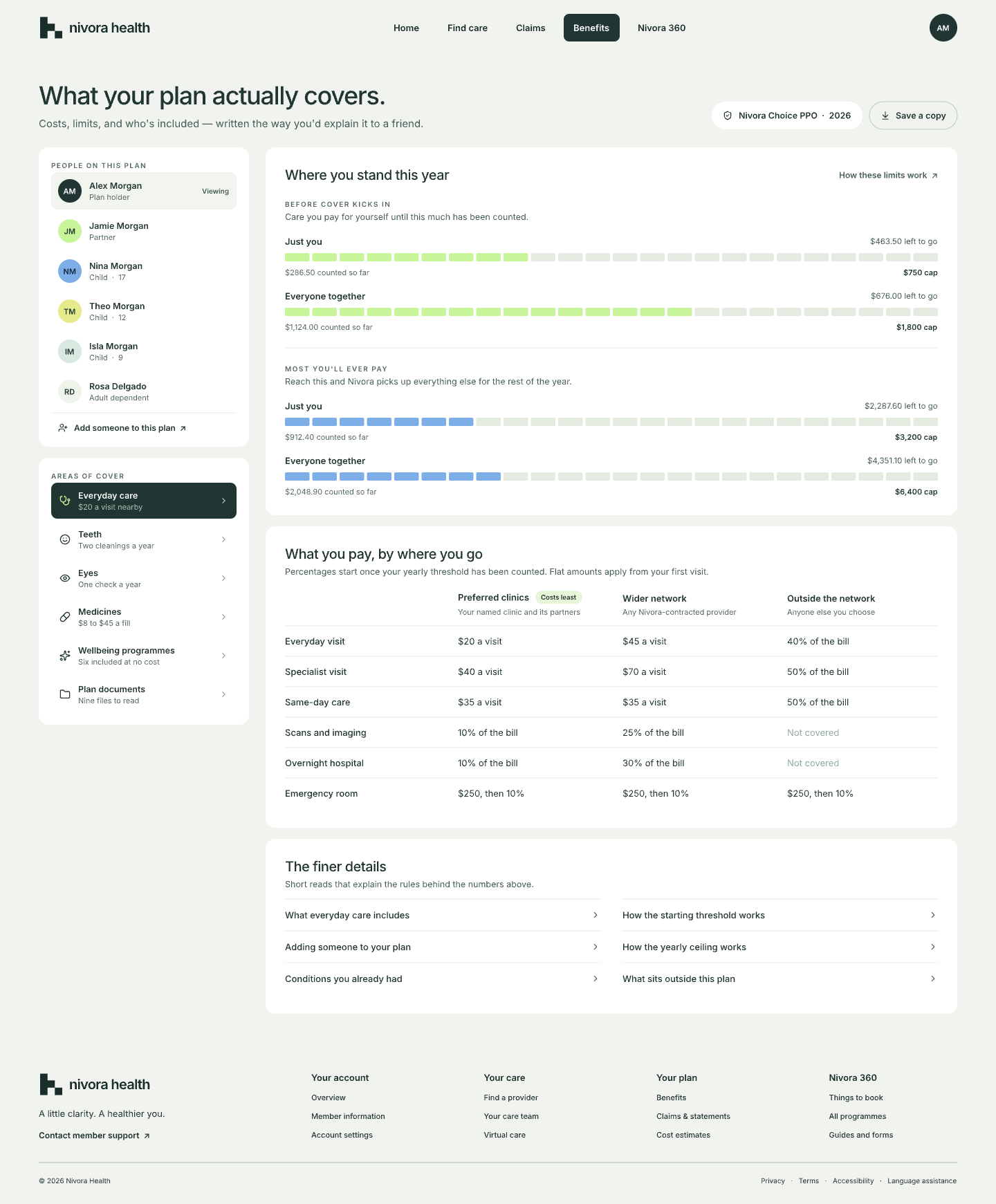
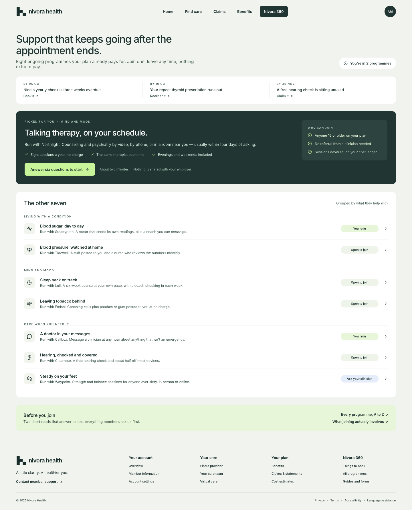
Salesforce Lightning gave us the foundation. Healthcare gave us the exceptions, so the system was extended, not reinvented.
Signal is the only action colour. Data blue is reserved for plan-share and charts. It never carries meaning on its own.
4 → 48 on an 8px base grid
6 controls · 10 chips · 14 panels · 20 cards
Flat · Raised · Overlay
1240 content · 100 margin · 24 gutter
120 hover · 200 state · 320 transition · ease-out
One stroke weight, one corner language, sized to the text it sits beside.
The programme never published uplift percentages, so this reports what actually changed in the product rather than invented numbers.
Six recurring healthcare tasks replaced six internal departments in the navigation.
Salesforce Lightning extended with healthcare-specific components and states.
Desktop, tablet and mobile designed from their own priorities, not compressed.
Status, meaning, action and support became the order of every surface.
From a portal you had to decode into a product that tells you where you stand.
Good healthcare products don't make people better at navigating healthcare systems. They make healthcare systems require less navigation.
The home surface should adapt to a member's current healthcare context instead of showing everyone the same hierarchy.
Insurance questions suit contextual assistance, as long as the explanation is transparent and a human stays one tap away.
Modern prototyping and AI-assisted builds close the gap between a concept and something a real member can try.