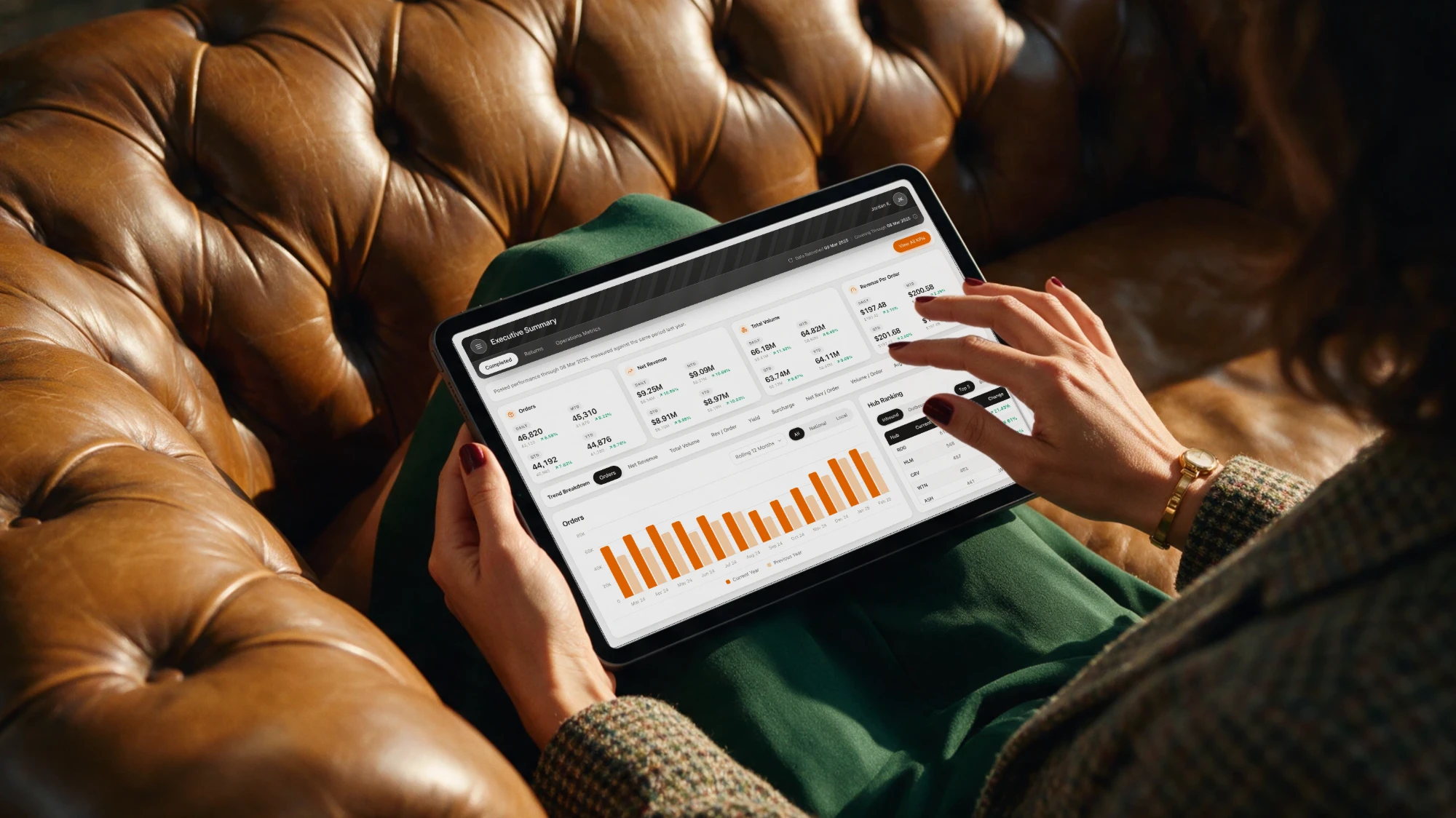
Aster Analytics
Turning a reporting portal into a place people come back to.
Marlowe Biopharma had the data. What it needed was a front door: somewhere the people running its patient programmes could see what was slowing a patient down, and know what to fix first.
Having led the audit of the legacy portal, I was asked back to design its successor, first as a blueprint, then as Aster: a fully interactive prototype of fifteen destinations, all built on one design system.
Challenge
The best analytics products are habit-forming. The legacy portal was the opposite. Every screen spoke its own dialect, and every answer arrived needing an explanation.
One portal, many dialects
Screens had grown one at a time, each with its own colours, charts and logic. Users relearned the product on every page.
Scale without sprawl
Fifteen destinations, six programmes, one small team. Designing every screen by hand was never an option. The system had to do the work.
A brand not built for data
A freshly refreshed palette whose colours couldn't reliably separate one series from the next.
Beautiful isn't buildable
Every gap between a comp and what a BI platform ships natively becomes rework for a team still learning the tool.
One brief. Four tensions.
And an MVP that had to launch on time.
Approach
A blueprint, not a blank canvas. The client brought the skeleton from our earlier audit; we put the muscle on it, in gated sprints, each signed off before the next began.
-
Listen
Daily check-ins across time zones, sessions with the experts, and a guided tour of the live portal. We ended by picking one customer journey to stand for many.
-
Structure
Clickable wireframes for layout, flow and navigation. Small technical tests proved every pattern would work on the platform before we polished it.
-
Style
A visual language for charts built on the refreshed brand, then detailed designs of the core page templates, reviewed and signed off.
-
Prototype
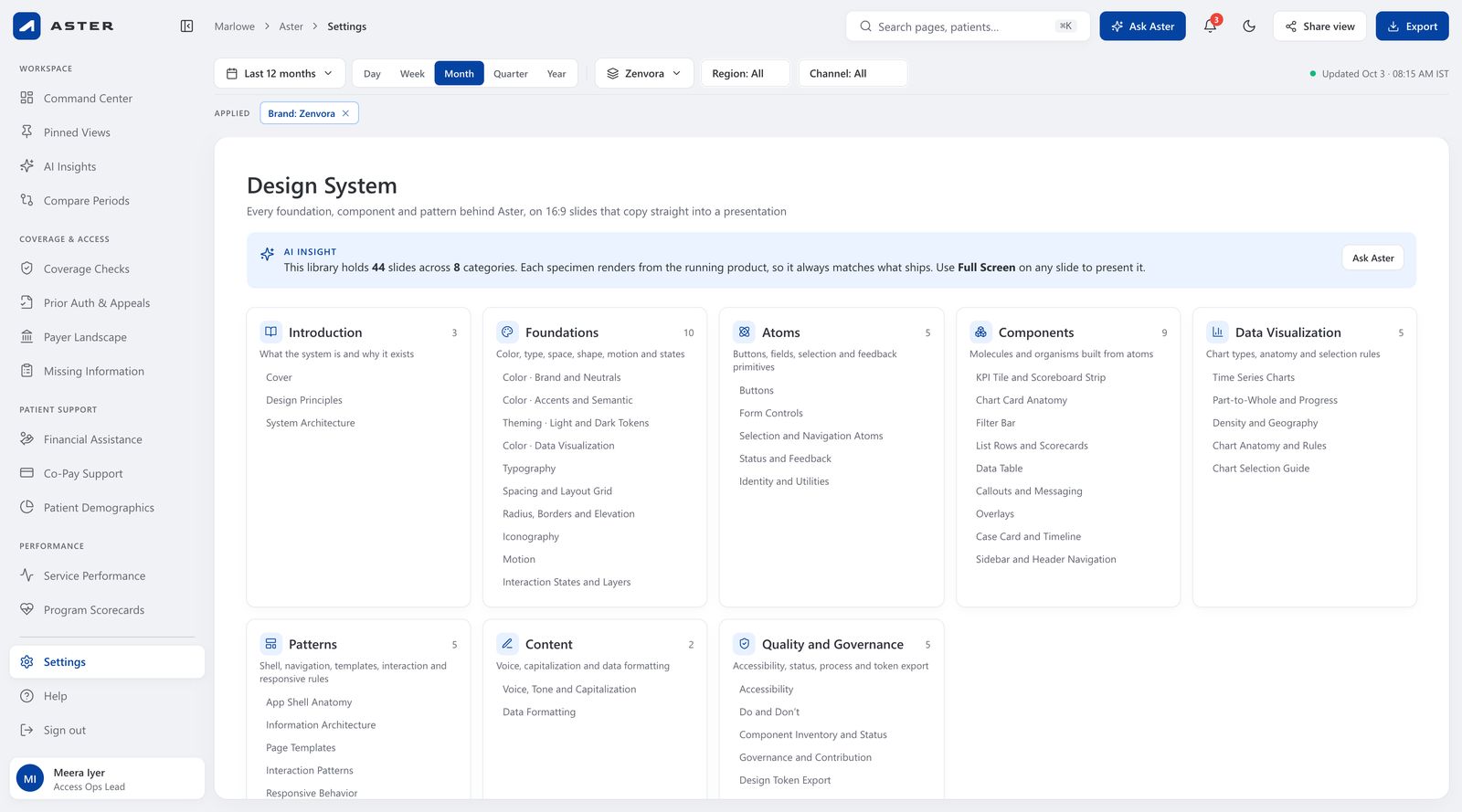
Aster itself: a fully clickable build of fifteen pages, with light and dark themes, AI answers and a 44-slide design system.
How we worked
Four rules we agreed on day one
- 01
Platform first
Use what the platform already does. Build custom only when the experience truly needs it.
- 02
Three rounds, then ship
Each screen gets at most three rounds of changes. Keeping momentum is a design decision.
- 03
Fast is part of beautiful
No visual is recommended until we have checked it runs quickly when built.
- 04
Web that travels
A responsive website, tuned for tablet browsers. No separate mobile app for version one.
Eight Calendar Weeks
Proposed plan, refined with the client
Solution
Design the pattern once, and let it repeat across every programme. One proto-journey became the template each destination inherits, so the fifteenth screen is as clear as the first.
- 01
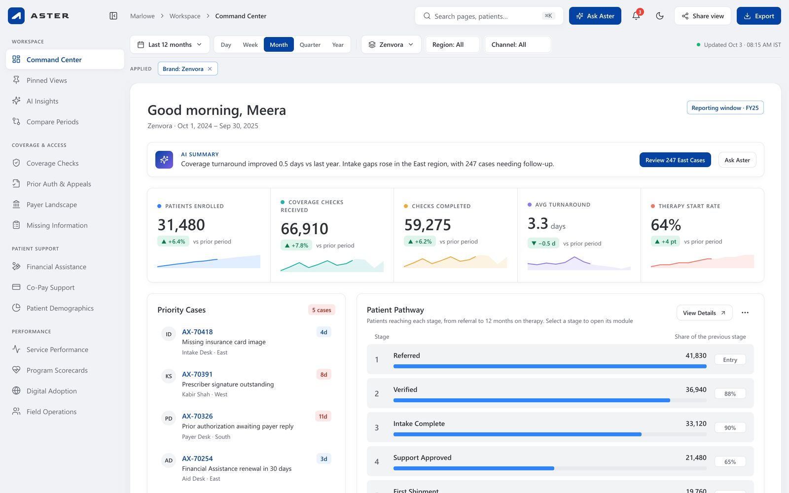
An AI summary first
The answer in a sentence, with the next action beside it.
- 02
A KPI strip
Value, trend and prior-period delta, always together.
- 03
Key visualizations
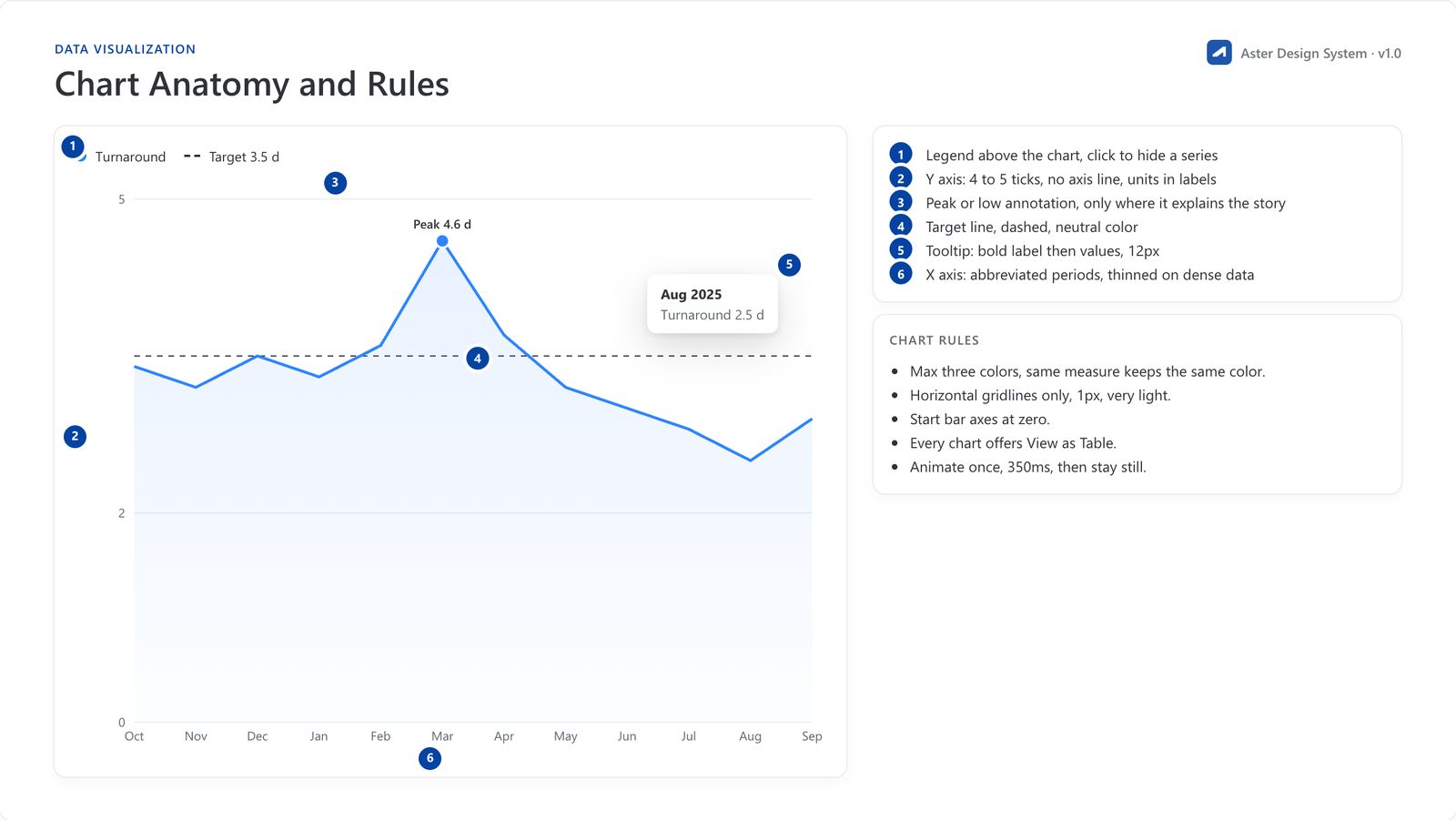
The why behind the number, one anatomy for every chart.
- 04
Details When Needed
Tables and deeper views are one click away, never in the way.
Ask Aster
The answer, with its working.
Ask in plain language. Aster answers from the data on the current filters, draws the chart that proves it, and links straight to the module behind it.
- Why did turnaround spike in Mar 2025?
- Which region drives intake gaps?
- What is driving Financial Assistance denials?
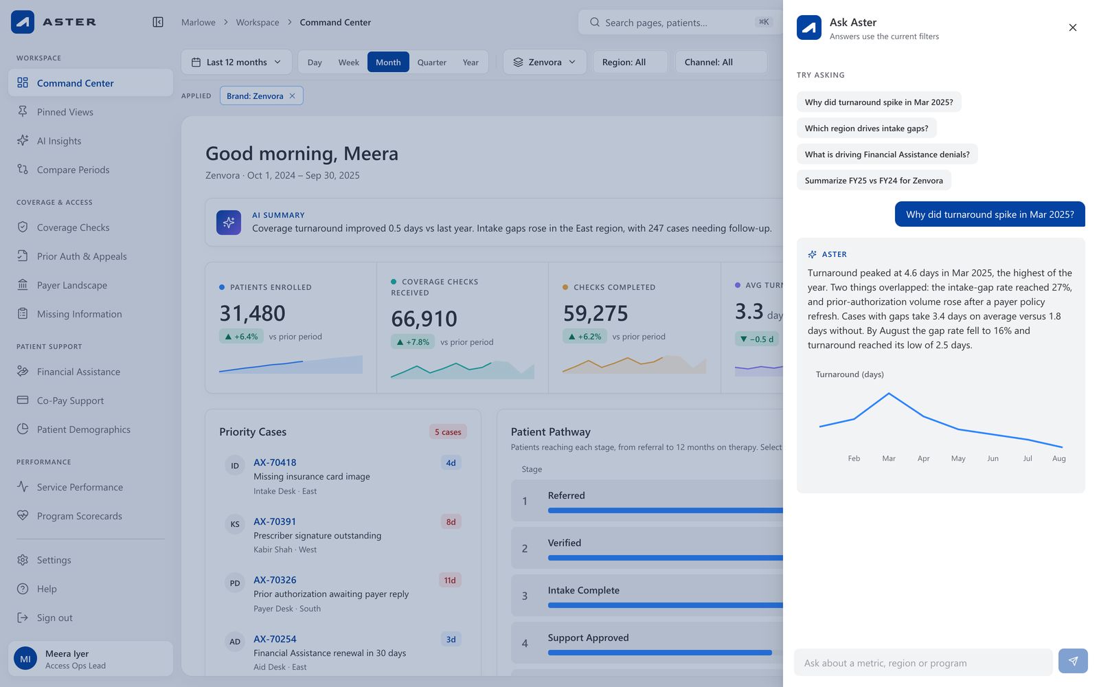
Simple Up Front, Deep When Needed
The main screen stays clean and easy to read. Filters, exports, sharing and detailed tables are one click away, so experienced users get what they need without crowding everyone else.
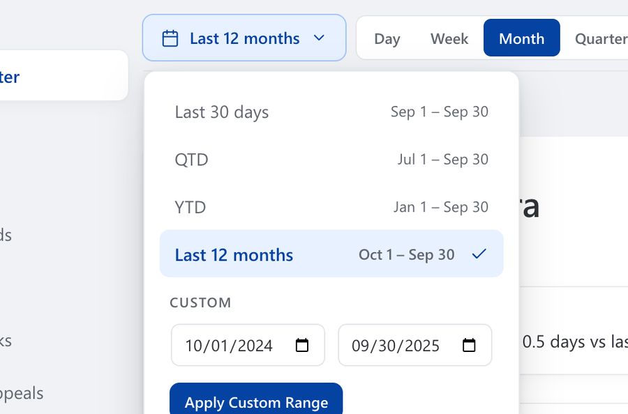
Date Range
Pick a time period from the presets, or set your own dates.
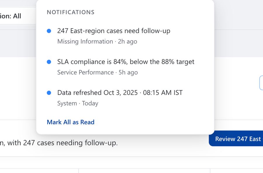
Notifications
Get an alert when a target is missed or new data arrives.
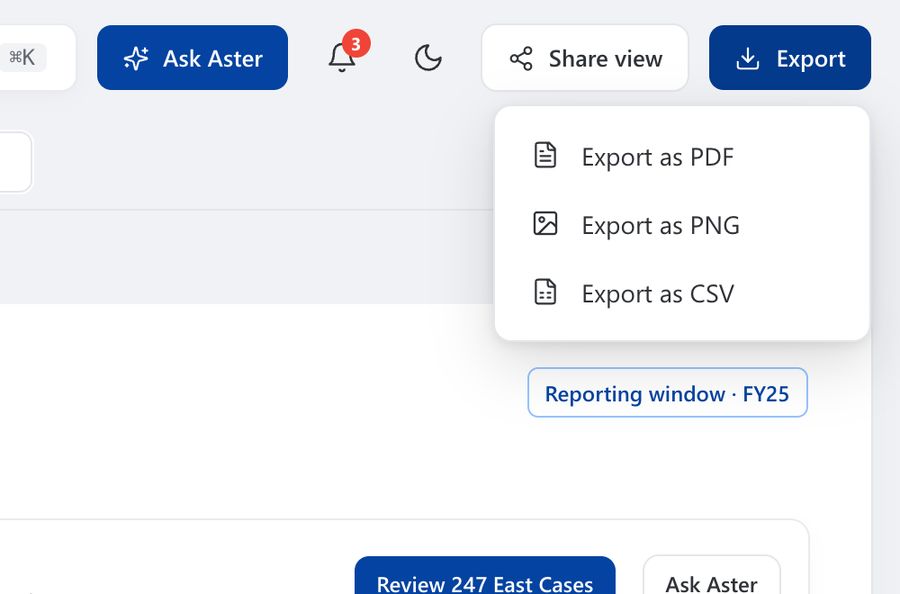
Export
Download any view as a PDF, an image or a spreadsheet.
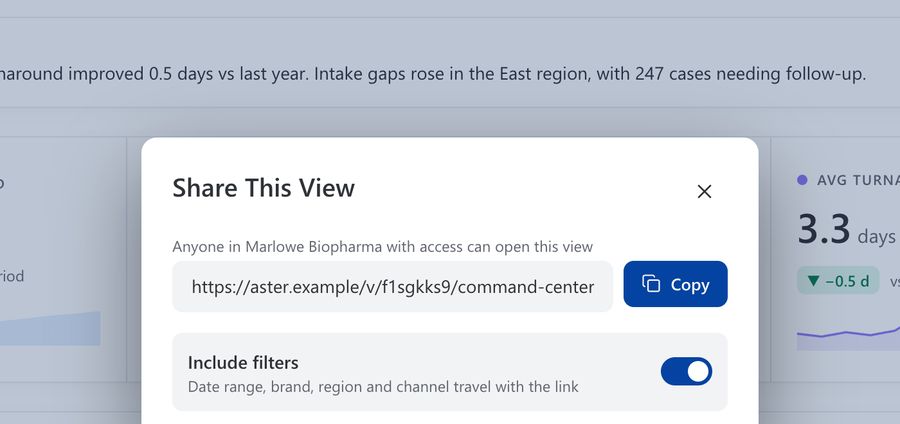
Share View
Send a link that keeps your filters, so others see what you see.
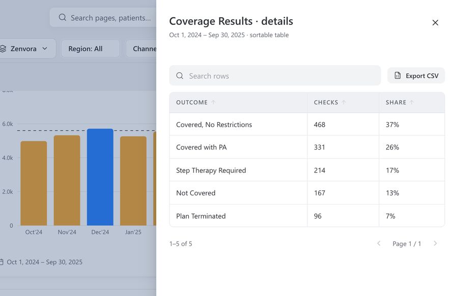
Details Drawer
Open the table behind any chart and sort it your way.
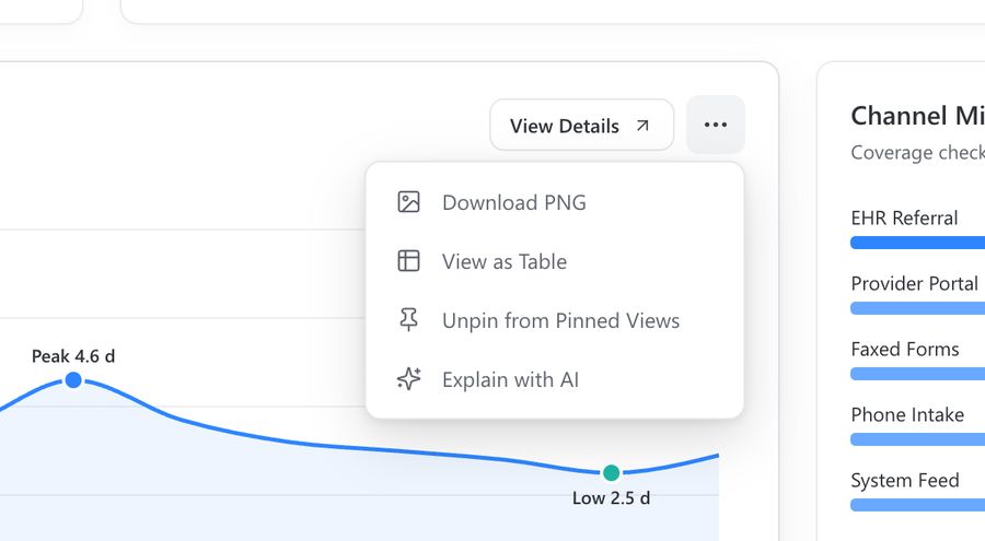
Chart Menu
Download a chart, save it for later, or ask AI to explain it.
A visual language, not a style sheet
Six levels, from tokens to pages, each depending only on the one before. Change the brand blue once and it travels everywhere, packaged as reusable templates the next product can inherit.
Brand
- Main #0443A1Actions, active states
- Point #2E85FFFocus rings, key series
- Sub #103061Deep surfaces
- Ink #2F3237Primary text
Data visualization · max three hues per chart
- Series 1#2E85FF
- Series 2#1FB5A5
- Series 3#F2A93B
- Series 4#8B7CF6
- Series 5#F2786A
- Neutral#979BA5
Blue means at or above target; amber means below. Colour encodes meaning, never decoration.
Typography
Segoe UI · tabular figures for every number
- KPI
- 32 / 40 · 600
- Heading 1
- 28 / 36 · 600
- Body
- 14 / 22
- Caption
- 12 / 18
- Overline
- 11 / 16 · caps
Design principles
- 01Insight first, detail on demand
- 02Meaning over sign
- 03One anatomy, many charts
- 04Calm density
- 05Accessible by default
- 06Instant, never staged
Components
Patients enrolled
31,480
+6.4% vs prior periodArchitecture · six levels, each depending only on the one before
- 40Level 1
Tokens
Colour, type, space, radius, motion
- 16Level 2
Atoms
Button, input, chip, badge
- 12Level 3
Molecules
KPI tile, filter group, callout
- 9Level 4
Organisms
Chart card, data table, drawer
- 4Level 5
Templates
Overview, deep dive, list, record
- 15Level 6
Pages
Every destination in the product
Impact
Our remit was the blueprint; the build belonged to the client. So this work is measured by what it made possible, not by uplift we never had the right to claim.
15
Destinations, one system
Four groups of navigation, each page built from the same templates.
12
Chart types, one anatomy
Bars to heatmaps, with a selection guide for when to use which.
44
Slides of design system
Tokens, components, patterns and governance, documented and live.
24
Themes × breakpoints
Light and dark across wide, desktop, tablet and mobile.
From a portal you had to be taught, to a product you simply use.
The best analytics products don’t demand attention. They earn a habit by removing every step between seeing a number and knowing what to do with it.
What I'd take forward
Design inside the build tool
Proving each pattern on the platform before polishing it meant nothing in the final screens had to be negotiated away in development.
Scale is a design decision
Choosing templates over screens turned an eight-week engagement into a system fifteen destinations could grow from.
Make the answer the interface
An AI summary on every page and a question box one keystroke away turned dashboards into conversations about what to do next.