
Research
Reviewed existing dashboards, user roles, report structures, and recurring operational tasks to identify usability gaps
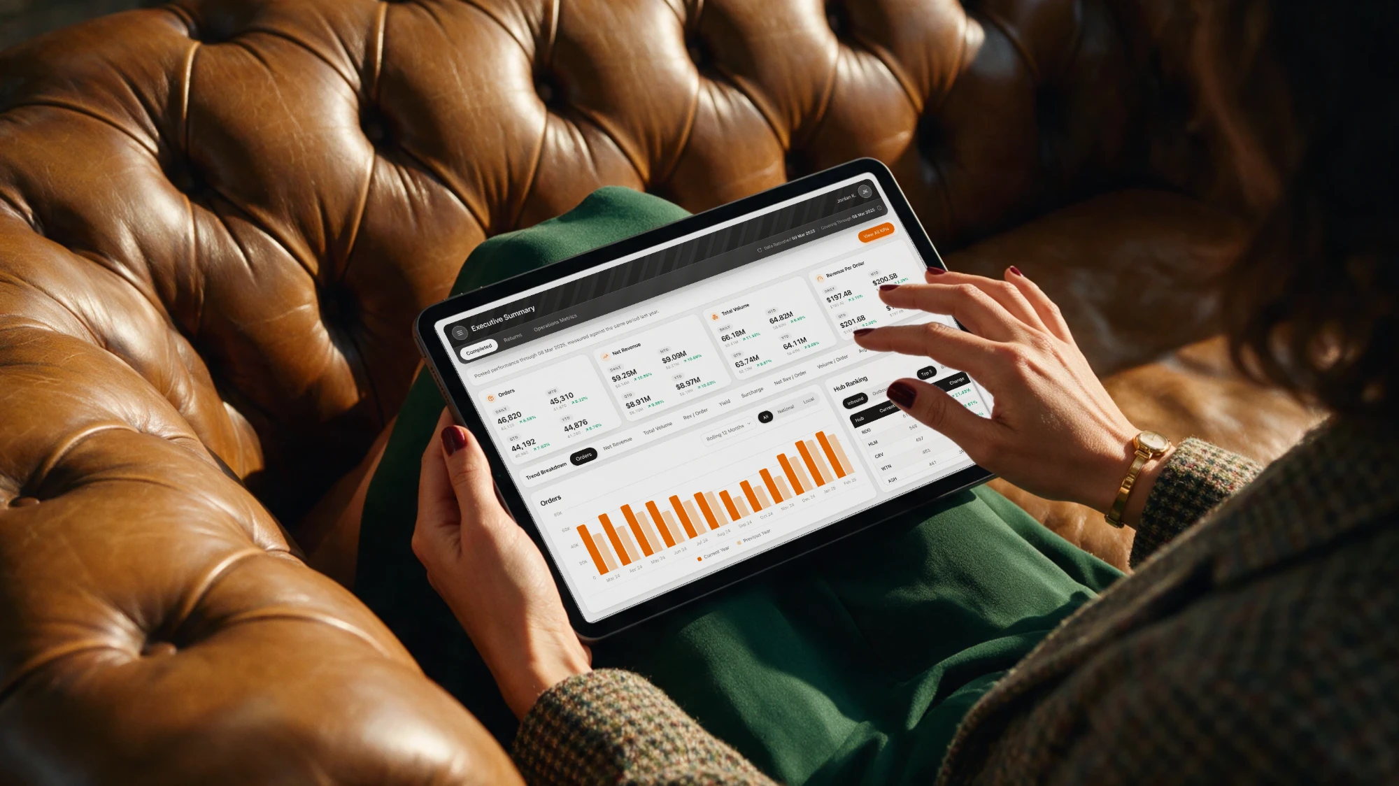
UX redesign of a freight and logistics reporting platform, focused on making operational data easier to find, understand, and act on across desktop and mobile
A large freight and logistics organisation relied on an enterprise business intelligence platform to monitor operational performance, shipment activity, service quality, revenue, and sales effectiveness.
Our team redesigned the reporting experience across more than 100 interface screens and 20 operational reports. My role covered UX research, information architecture, interaction design, data visualisation, UI design, design-system development, platform validation, and developer handoff.
Users struggled with dense dashboards, inconsistent layouts, complex report navigation, and limited mobile access across the reporting platform.
Critical reporting experiences were primarily designed for desktop
Finding the right report or KPI required too many steps
Similar reports used different layouts, patterns, and interactions
Related operational insights were spread across disconnected reports
Tables and dashboards lacked clear hierarchy and scanability
Audited existing reports, mapped user needs, restructured information architecture, and translated findings into wireframes, dashboard patterns, and responsive flows.
Reviewed existing dashboards, user roles, report structures, and recurring operational tasks to identify usability gaps

Reorganised reports around user goals and business functions rather than the underlying system structure

Explored dashboard hierarchy, navigation, filtering, KPI patterns, tables, charts, and responsive behaviours through wireframes and prototypes

Worked through stakeholder and platform reviews to ensure designs could be translated into the existing BI environment
Created a unified dashboard system with clearer navigation, consistent KPI and chart patterns, reusable components, and responsive desktop-to-mobile layouts.

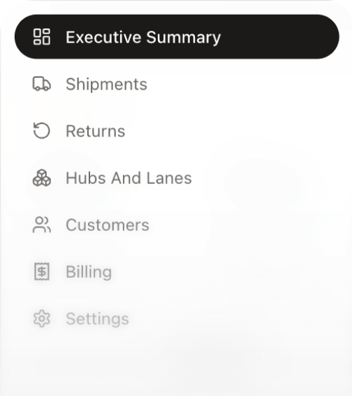
Reports were organised around operational and business tasks, making it easier to move from high-level performance to detailed insights.

A predictable structure placed filters, KPIs, trends, comparisons, and detailed data in a consistent order across reports.

Charts, KPI cards, tables, and status indicators were redesigned to improve comparison, readability, and interpretation.

Mobile layouts prioritised essential KPIs, trends, and actions rather than compressing the full desktop experience.
Reusable patterns for typography, colour, spacing, filters, tables, charts, KPI cards, and navigation created consistency across reports.


Established a scalable reporting framework that improved consistency, reduced design ambiguity, and gave product and development teams reusable standards for future reports.
Multiple operational reports now shared a consistent structure and interaction model


Shared components and documentation gave design and development teams a common reference point
Responsive patterns extended key reporting experiences beyond desktop workflows


Reusable dashboard, navigation, chart, table, and KPI patterns created a framework for designing future reports without starting from scratch
From disconnected reports to a unified enterprise reporting experience
The work moved the platform beyond individual dashboard redesigns, creating a shared UX framework that could support both existing reports and future reporting needs.