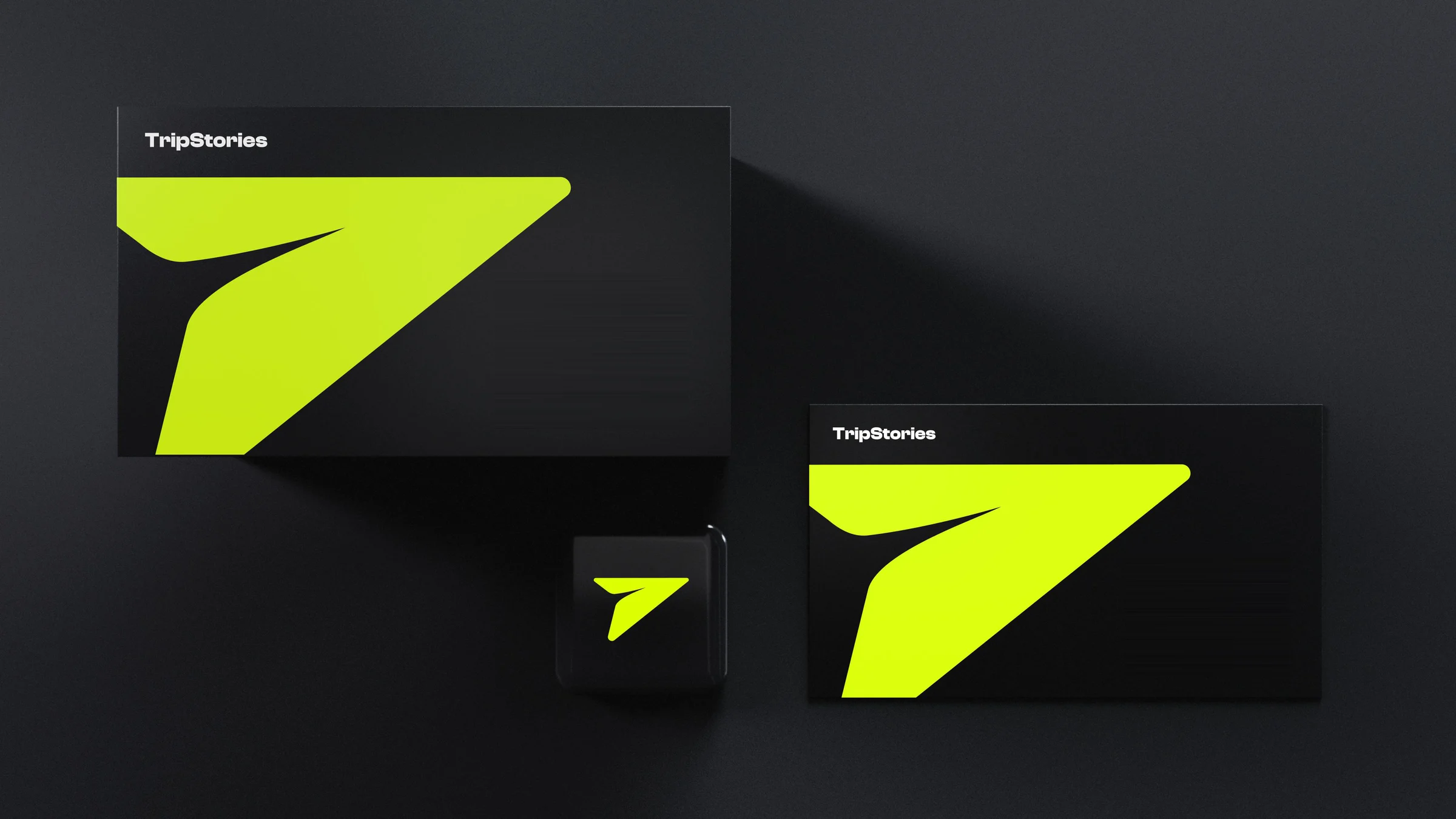
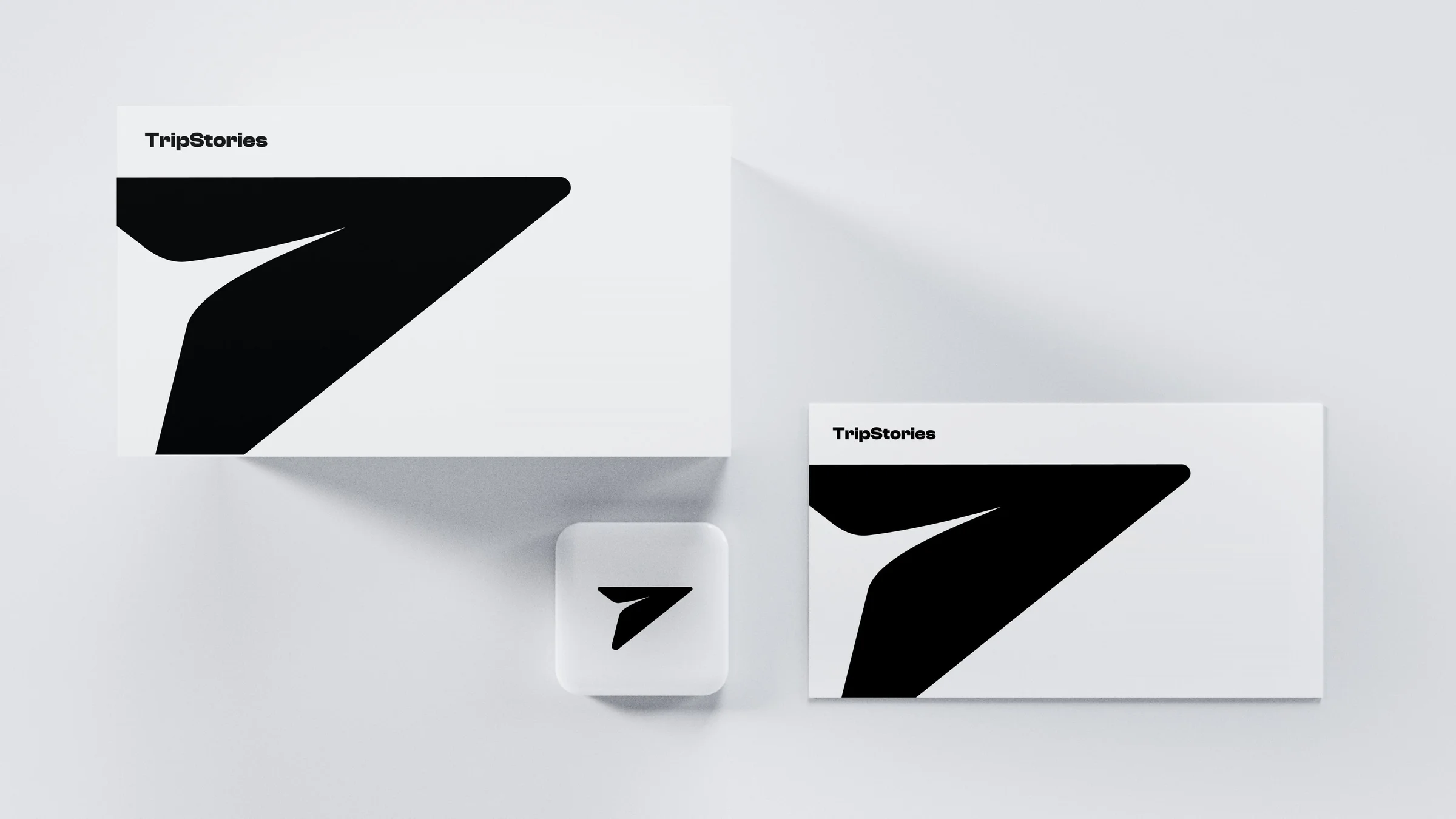
TripStories doesn’t sell trips. It publishes journeys.
A premium travel authorship firm needed an identity as precise as its logistics and as expressive as its stories. We built one mark, one logotype and one rulebook that carry both, from the first tap on the app to the last page of a printed journey.
4brand values
3logo lockups
1mark, three ideas
A brand that moves like a story.
Role
Brand Identity Lead
Timeline
6 months
Scope
Strategy, Logo system, Brand guidelines, Stationery, App icon
Sector
Travel · Authorship
01 — Context
A firm built on detail A mark that said nothing
The previous identity leaned on the outline plane every travel brand uses. It was thin, generic and impossible to own, and it gave no hint that TripStories writes journeys as carefully as it runs them.
The task wasn’t to look more like travel.
It was to look like authorship.
01
Generic
The same plane icon as every other travel brand.
02
Fragile at small sizes
Hairline strokes broke up on a favicon and an app icon.
03
Silent on storytelling
Nothing in the form said writing, curation or voice.
The insight
A trip is a story with logistics
Topic — 1.1
Logistics
Precision, speed and calm. The part of travel that must never fail, and that the traveller should never have to think about.
Topic — 1.2
Narrative
The pen, the voice and the chapter. The part of travel people keep, and tell again when they are home.
02 — Logomark
One form, three ideas
The mark merges a paper plane, a pen nib and a send icon into a single aerodynamic shape. Its ascending angle is forward momentum, and its sharp, purposeful geometry holds from a favicon to a billboard.
Logomark construction
01
Paper plane
Travel, lightness and arrival.
02
Pen nib
Authorship, voice and care.
03
Send
Connection, intent and momentum.
03 — Logotype
A name set with confidence
Clash Display Bold gives the wordmark a modern, sophisticated edge. Its clean lines and balanced proportions stay legible at any size, and the shapes read as precise without feeling cold.
The mark and logotype are combined into fixed lockups, so the brand reads the same on a dark screen, a lime tile or a white page.
White on blackApp tile and wordmark on blackBlack on white
05 — Clear space and minimum size
Room to breathe, a floor to hold
Keep one letter height of clear space on every side. Below 50px digital or .75 inch in print, the detail starts to fail, so the mark never goes smaller.
Clear space · x equals one letter height
50px
100px
Minimum size · 50px digital, .75 inch print
06 — Colour
Lime is the signal
Three colours do the work. Black and white carry the reading, and lime marks the moment that matters. It is never used for body text on white.
Lime
Hex
#CEFE46
RGB
206 · 254 · 70
20%
40%
60%
80%
Black
Hex
#121212
RGB
18 · 18 · 18
20%
40%
60%
80%
White
Hex
#FFFFFF
RGB
255 · 255 · 255
20%
40%
60%
80%
07 — Typography
A scale that stays calm
Four sizes, one family. Headings set tight, copy set open, and nothing decorative in between.
64 px
Heading 1
48 px
Heading 2
36 px
Heading 3
24 px
Heading 4
Common mistakes
hello there
No script or light cuts
hello there
No rotation
hello there
No tight tracking
Don’t centre align until exception
No centred paragraphs
too much shadows
No heavy shadows
Don’t squeeze
No stretching or squeezing
08 — Voice and values
Four values, four tones
The identity is built to behave the way the company does: depth in the story, precision in the plan.
Value 1
Narrative Depth
Authentic stories and cultural detail, written for the person travelling.
Value 2
Logistical Precision
Speed and stability, so every connection holds without being noticed.
Value 3
Seamless Connectivity
One journey, one thread, from first idea to the flight home.
Value 4
Refined Elegance
Premium standards in the plan, the page and the product.